Lensy is a modern photo-sharing and discovery platform designed for photographers, creators, travelers, and visual artists who want to showcase their creative work and connect with a like-minded community. The platform allows users to explore high-quality photography collections, upload their own work, discover trending creators, create curated galleries, and engage with visual content in an immersive experience.
The interface focuses on a dark-themed aesthetic to enhance image visibility and create a premium gallery experience. The platform combines social interaction, creative exploration, and portfolio presentation into a single seamless ecosystem for photography enthusiasts.
Category
Platform
The Goal
The primary goal of this project was to design a visually immersive and user-friendly platform where users can:
Explore high-quality photography content easily
Share their own creative work with the community
Discover photographers and trending collections
Build a professional online photography presence
Experience smooth and engaging visual navigation
Interact with creative content in an inspiring environment
The design also aimed to create a minimal yet modern interface that keeps the focus entirely on visual content.
The Challenge
During the design process, several UX and UI challenges were identified:
Creating a visually rich interface without making it overwhelming
Managing large amounts of image content while maintaining usability
Designing smooth navigation between categories and galleries
Keeping users engaged for longer browsing sessions
Building a community-oriented experience without cluttering the interface
Ensuring the platform feels premium and professional for creators
Organizing photography collections in an intuitive structure
Another major challenge was balancing aesthetics with functionality, ensuring users could easily discover content while enjoying a visually immersive experience.
The Solution
To solve these challenges, the platform was designed with:
A clean dark-themed interface to highlight photography content
Masonry-style image layouts for better visual exploration
Category-based browsing for quick content discovery
Minimal navigation system for distraction-free interaction
Community sections to discover creators and trending content
Organized collections and curated galleries
Consistent spacing and visual hierarchy for smooth scanning
Large visual previews to improve engagement and emotional connection
The final solution delivers a modern photography platform experience that is elegant, immersive, and community-focused.
Design Process
I was in responsible for both strategy and visual design for this project as the experience designer.
Discover Phase

Define Phase
Parsonas
I developed a persona that represents the ideal application user using the information gathered from the survey and interviews. Because the persona provided a thorough insight of the user's objectives, problems, and general personality, it assisted me in coming up with better solutions.
Empthay Map
This procedure was carried out in order to better define the target audience and provide examples of their demands and behaviors. I was able to understand their feelings and thoughts by using empathy mapping. The empathy map's information is derived from user interviews.

User Journey Map
To identify areas where we can enhance the user experience, we created a visual representation of the user's journey across all of our applications touchpoints.

Ideate Phase
User Flow
To show how the user will move around the application, I used Miro to construct a flow.

Card Sorting
To further help in the organization of the information architecture, all the features were categorized under several parts using card sorting.

Information Architecture
To better fit the application's goals, the card sorting was significantly improved. To make them easier to find, some of the features were re-categorized.

Design Phase
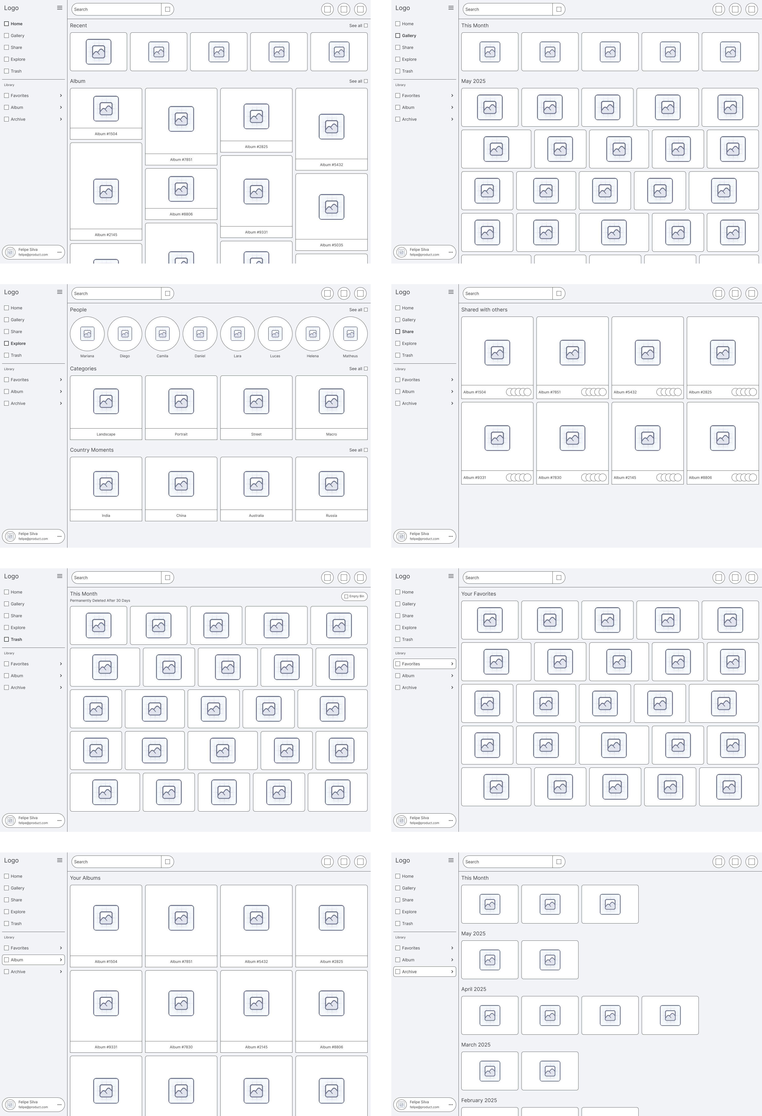
High Fidelity Wireframes
I started by drawing the Low Fidelity Wireframes on paper. I used Figma to construct these High Fidelity Wireframes after making the necessary adjustments in accordance with the design standards.
Colors
To create the Final Design I choose these colors.

Typography
In this Design I preferred to use this Font Family and the scale of the Font Size.

Logo
Here are the logo's which represent this Brand.
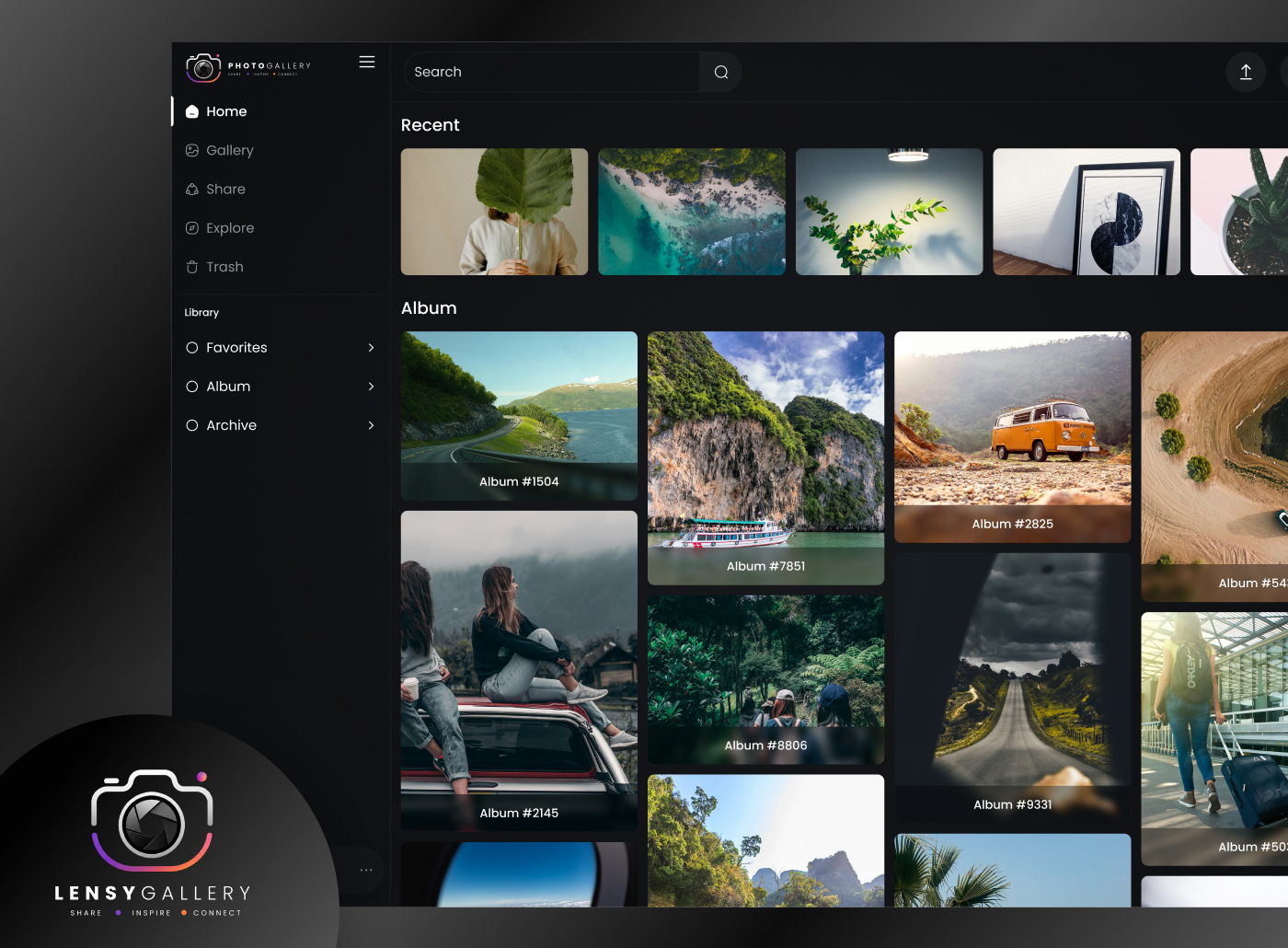
Designed Screens
Well-structured UI screens focused on improving usability and enhancing user satisfaction.
Test Phase
Usability Testing
Usability testing was conducted with 10 participants from the target audience.

Implementing Feedback
The suggestions form usability testing were considered and the following changes were made.