Support System is an omnichannel customer support platform that helps users raise, manage, and track complaints through email, chat, social media, chatbots, and calls in one centralized system. The platform improves customer experience by simplifying ticket submission, providing real-time updates, and enabling support teams to manage complaints efficiently through a unified dashboard.
Category
Platform
The Goal
The goal of this project was to design a seamless omnichannel support platform that allows users to raise, track, and manage complaints easily through multiple communication channels such as email, social media, chatbots, and phone calls.
The primary objective was to simplify the ticket creation process, reduce customer effort, improve response time, and create a centralized system where all support conversations could be managed efficiently.
The platform aimed to:
Improve customer satisfaction
Reduce repetitive communication
Streamline complaint handling
Provide transparency in ticket tracking
Enable faster issue resolution
The Challenge
Customers faced major difficulties while interacting with support systems because communication channels were disconnected and inconsistent.
Some key challenges included:
1. Fragmented Communication
Users had to switch between different platforms like email, social media, and calls to raise complaints. This caused repeated explanations, lost information, and frustration.
2. Slow Response Time
There was no centralized workflow for managing complaints, resulting in delayed responses and inconsistent customer support experiences.
3. Lack of Transparency
Users could not easily track complaint status or expected resolution times, leading to repeated follow-ups and low trust in the support process.
4. Poor Ticket Submission Experience
Existing forms were complicated, time-consuming, and lacked guidance. Many users submitted incomplete information, increasing agent workload.
5. Cross-Team Coordination Issues
Support agents across departments had difficulty accessing previous conversations, attachments, and complaint history.
The biggest challenge was creating a unified support experience that works smoothly across all channels while remaining simple and intuitive for users.
The Solution
To solve these problems, I designed a centralized omnichannel support system where users could create and manage tickets from a single platform regardless of the communication channel.
The solution included:
Unified complaint dashboard
Multi-channel ticket creation
Real-time ticket tracking
Simplified forms
Attachment support
Automated ticket categorization
Centralized communication history
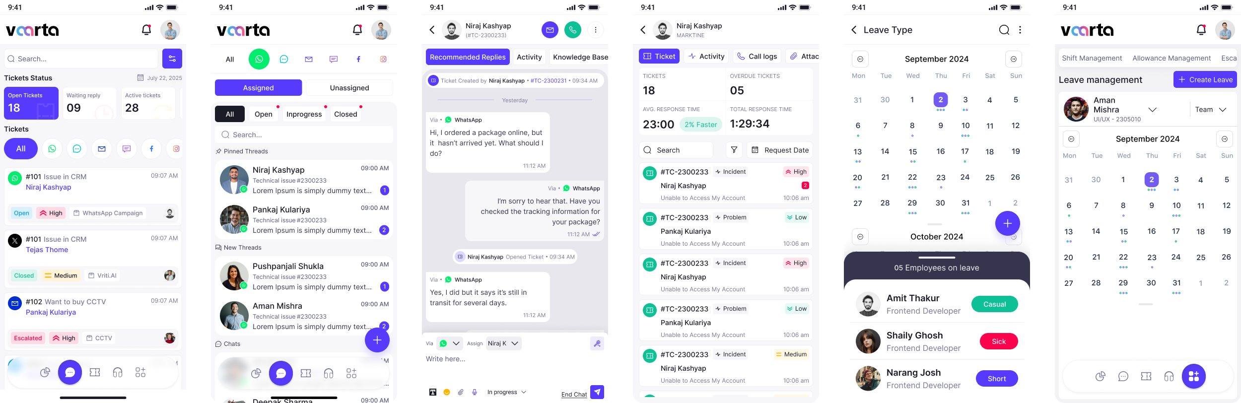
User-friendly mobile and web interfaces
The platform ensured that all customer interactions were stored in one place, reducing confusion and improving support efficiency.
Design Process
I was in responsible for both strategy and visual design for this project as the experience designer.
Discover Phase

Define Phase
Parsonas
I developed a persona that represents the ideal application user using the information gathered from the survey and interviews. Because the persona provided a thorough insight of the user's objectives, problems, and general personality, it assisted me in coming up with better solutions.
Empthay Map
This procedure was carried out in order to better define the target audience and provide examples of their demands and behaviors. I was able to understand their feelings and thoughts by using empathy mapping. The empathy map's information is derived from user interviews.

User Journey Map
To identify areas where we can enhance the user experience, we created a visual representation of the user's journey across all of our applications touchpoints.

Ideate Phase
User Flow
To show how the user will move around the application, I used Miro to construct a flow.

Card Sorting
To further help in the organization of the information architecture, all the features were categorized under several parts using card sorting.

Information Architecture
To better fit the application's goals, the card sorting was significantly improved. To make them easier to find, some of the features were re-categorized.

Design Phase
Colors
To create the Final Design I choose these colors.

Typography
In this Design I preferred to use this Font Family and the scale of the Font Size.

Logo
Here are the logo's which represent this Brand.
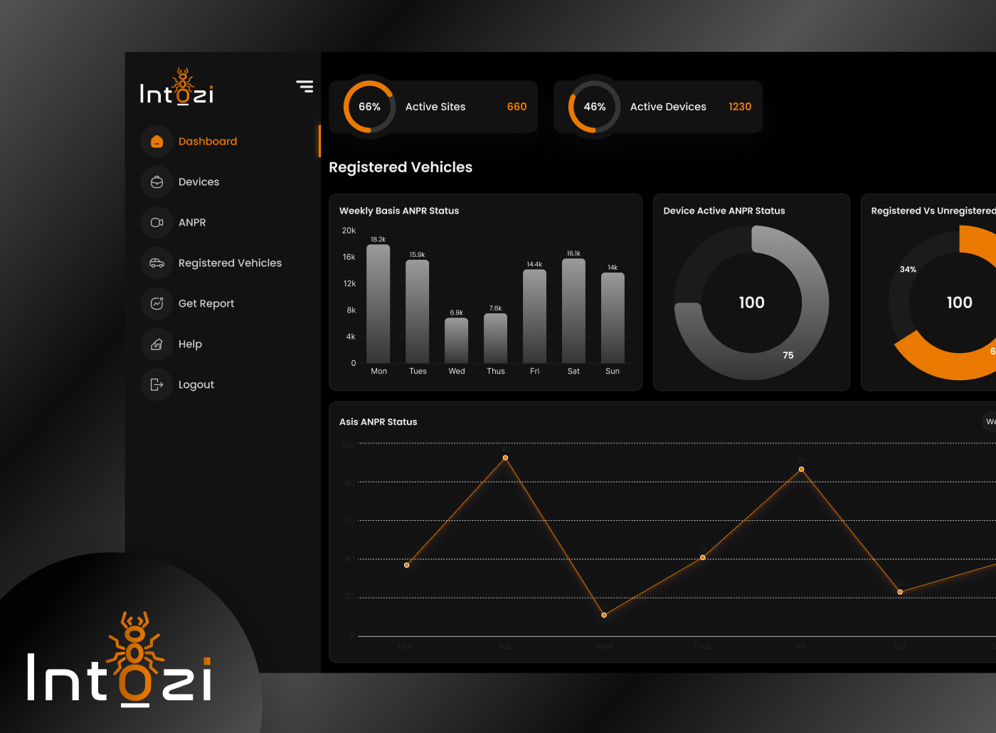
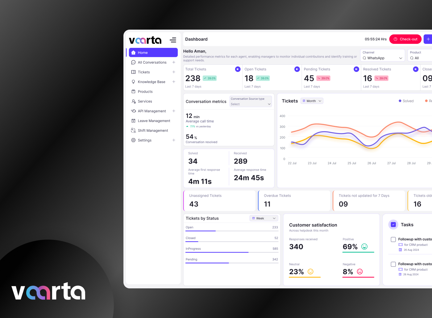
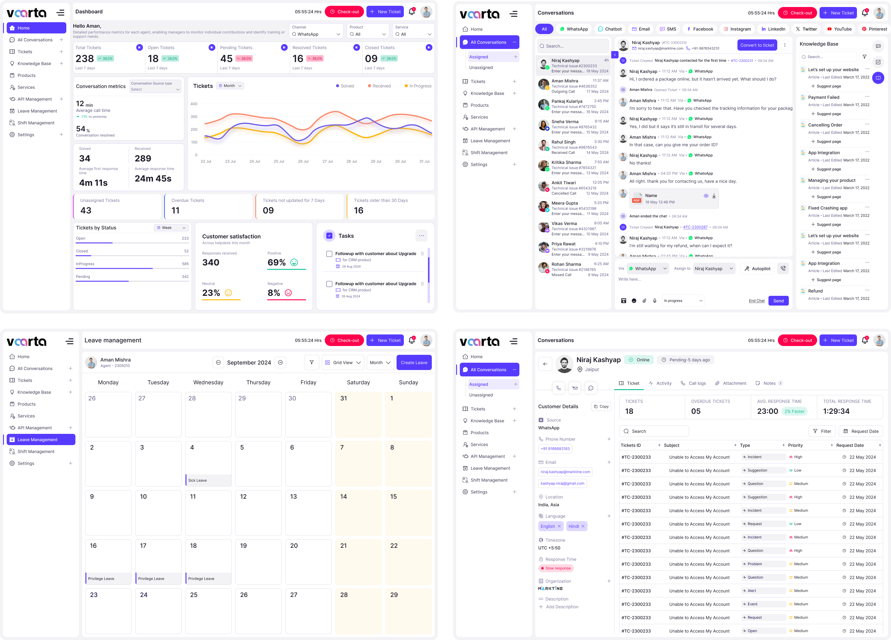
Designed Screens
Well-structured UI screens focused on improving usability and enhancing user satisfaction.
Test Phase
Usability Testing
Usability testing was conducted with administrators, security guards, and parking management staff to evaluate the usability and efficiency of the ANPR system.

Implementing Feedback
The suggestions form usability testing were considered and the following changes were made.